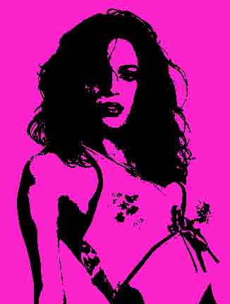
Ok the popart tutorial... Now a photo of yourself is necessary over many places on the web... The photo in the messengers, your profiles in blogger or orkut, or for signatures in forums and message boards... Or even the wallpaper on your cellphone. Just a pic gets boring, and popart is a pretty cool (to use a relevant word, groovy) way to spice up your photo, and although popart like this
may look too complicated to make, its actually pretty damn easy to pull off if you have photoshop.
There are three important facets in this kind of popart, the sketching part, which makes it look like its drawn, the coloring, and finally, the halftone (grains or dots). There are various ways to tackle each, and the different methods are listed, just pick one from each to make your own combo.
For no apparent reason, I just picked a photo of Mallika Sherawat for this tutorial. The elementary steps involve duplicating your image before you work on it to preserve the original. Don't just read, try these things out. Layers>Duplicate layer should do the trick. Once this is done, you are ready to start. The simplest popart is to use a threshold and a color.
Image>Adjustments>Threshold. Slide the bar till you get a recognizable picture, and then Image>Adjustments>Hue/Saturation
Click on colorise. Increase the saturation. Reduce the lightness
And the result is this:
Ok, now the dirt
Part I
Sketching
Method 1
Image>Adjustments>Threshold
Set foreground/background color to white/black
Filter>Sketch>Photocopy
Low detail, high darkness
Method 2
Filters>Stylize>Photocopy
Low detail (1-7)
High Darkness (30-50)
Then do Method 1 again
Part II
Coloring
Whatever you do, you need to play around with the transparency of the topmost layer for coloring... (layer>transparency)
Method 1
Paint the layer underneath
Reduce the transparency of the topmost layer (layer>transparency) and then use a brush to paint the required color. Nice effect, looks like its actually drawn. Exceed the boundaries a wee bit, the effect will be nice.
Method 2
Filter>Blur>Smart Blur
Full Radius, Full Threshold
Image>Adjustments>Hue/Saturation
Click on colorise. Increase the saturation. Reduce the lightness
Filter>Artistic>Cutout
No of Levels: Full
Edge Simplicity: 0
Edge Fidelity: Full
Image>Adjustments>Brightness/Contrast
Increase brightness till desired image is achieved
Method 3
Bucket fill the areas enclosed by the black boundaries with the desired colors (This effect gives you the look of NFS Underground if you skip the cutout step)
Part III
Halftone
Method 1
Layer> Duplicate Layer (new file)
The picture should be replicated in a new file
Image>Mode>grayscale
Image>Mode>Bitmap
Method: Halftone Screen
Frequency (very low), I used 3 lines/cm
Shape: Any that you please!
Ok
Now import this pic as a layer back to the original image you were working on and reduce layer transparency
Method 2
Filter>Pixelate>Color Halftone
Max radius: Very low (between 4 to 8)
Leave the other settings untouched
Layer>Transparency>Around 60%
Method 3
Filter>Sketch>Halftone Pattern
again, reduce transparency
some more of em Sherawat Poparts, just to give you an idea of how it should look
Ok... Sketching: Method 2, Coloring: Method 3, Halftoning: Method 1
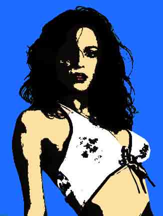
Sketching: Method 2, Coloring: Method 1, Halftoning: Method 1
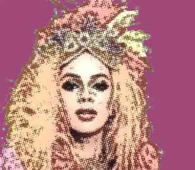
The NFS underground effect
A note on thresholds
Now this is the integral step, and you need to do a few practice runs before you get it right. Usually, the graph shows up something like this, for a normal base image:
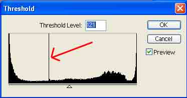
The spike in the middle is where the image goes from being more dark to more light. If you use the photocopying filter, the graph shows up like this:
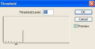
Don't worry, slide it till you get an image anyway, although it looks wrong. If however, you colorize it, it somewhat recovers and comes back to normal, like this:
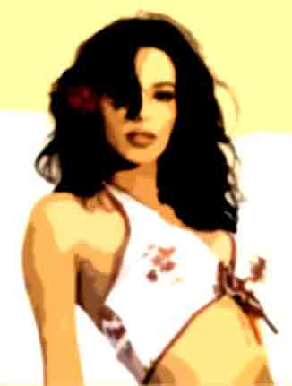
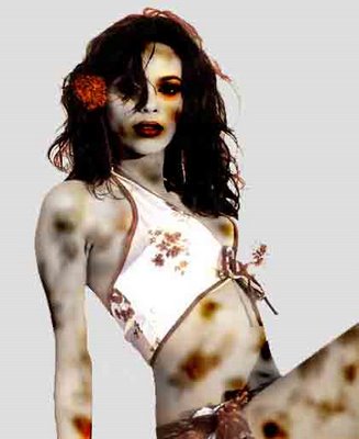
Now this is the important part, although the settings are shown here, unlike the other settings, this one depends a lot on the image for the final outcome, but there is a live preview, so you can choose the most suitable image. Have fun. And for those who hate Sherawat, here is a zombified version:
1 comment:
this rocks... d pics i mean!
Post a Comment